“According to the laws of aerodynamics
the bumblebee can’t fly. But the bumblebee
doesn’t know that, so it just carries on flying around.”.
- Bay, Michael -
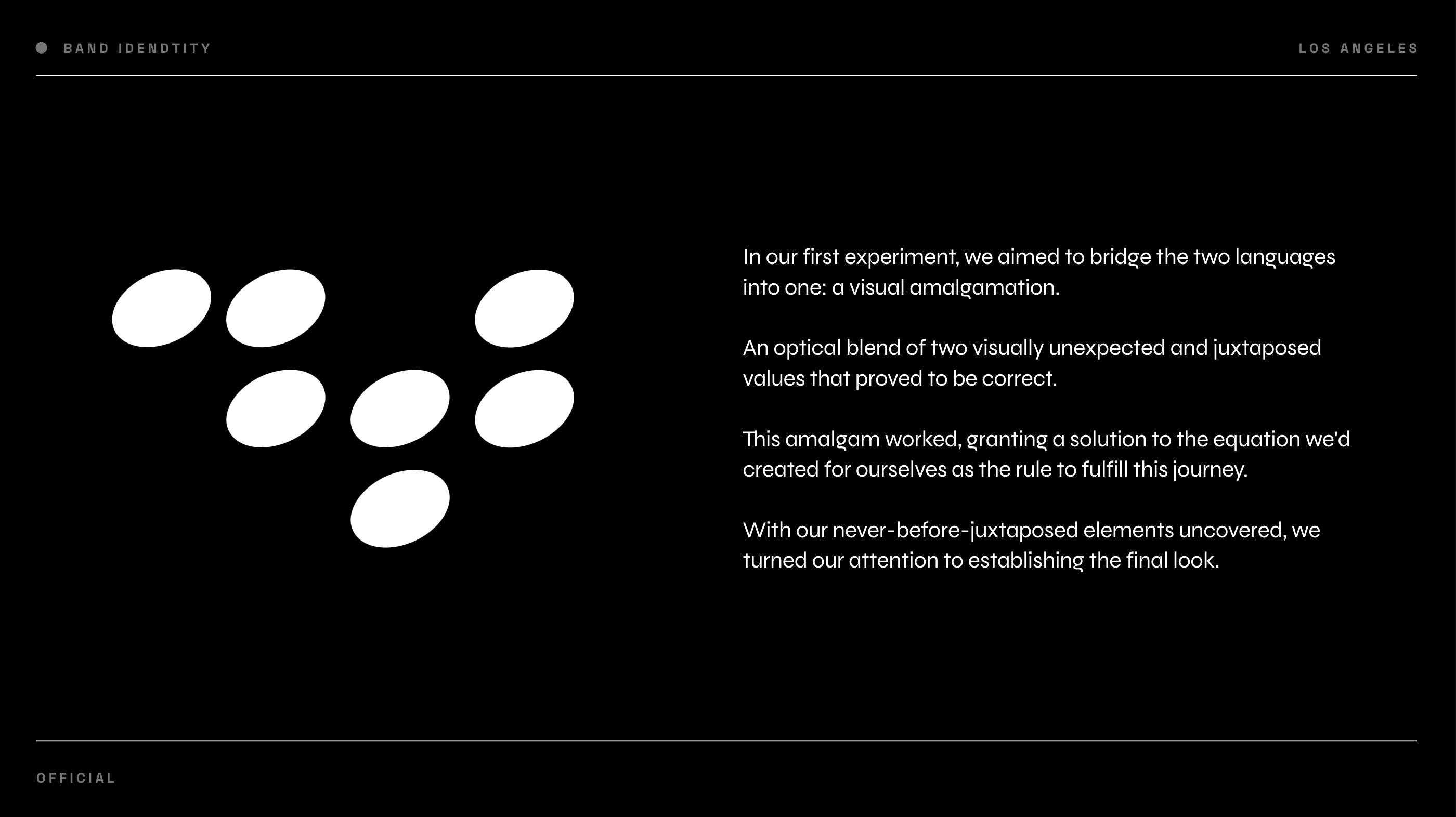
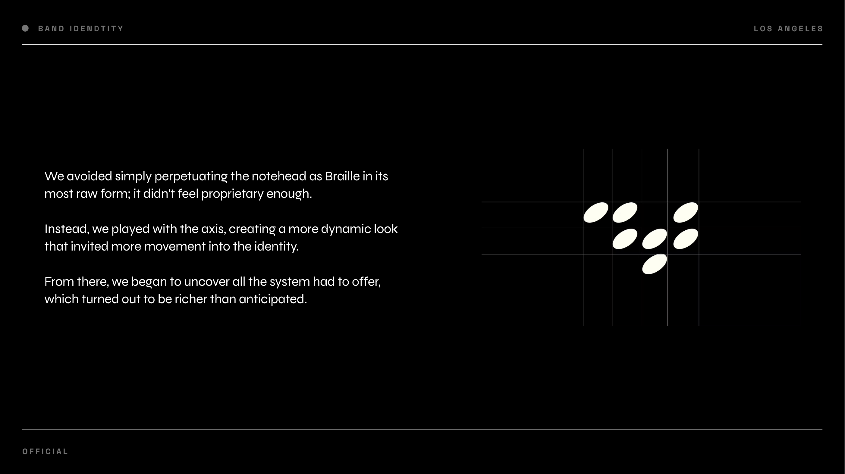
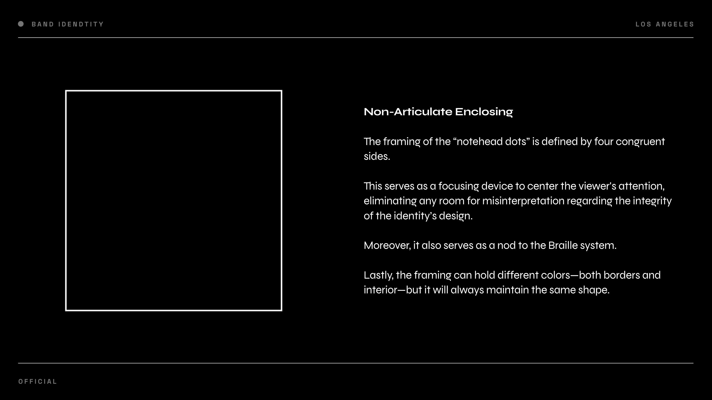
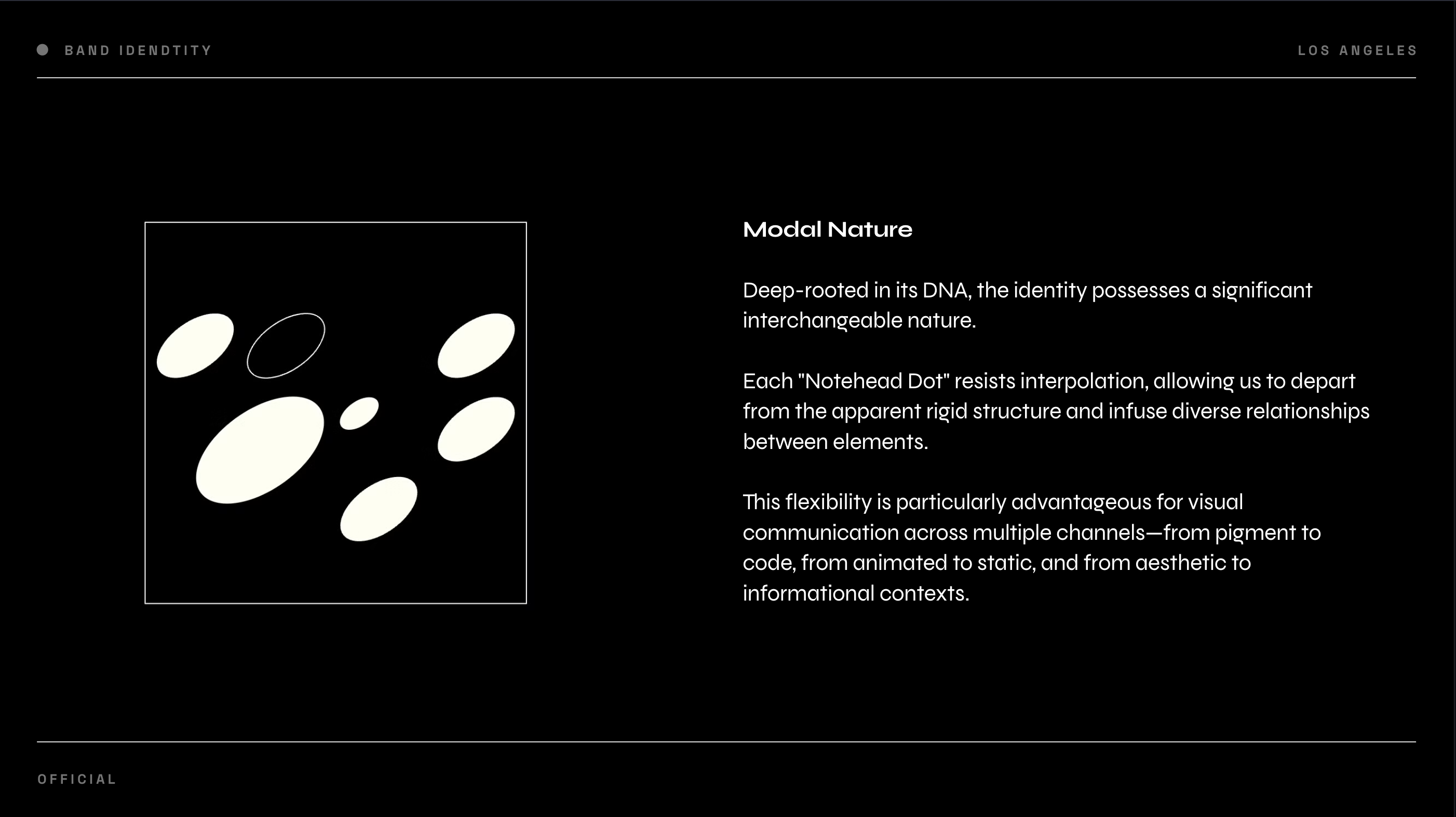
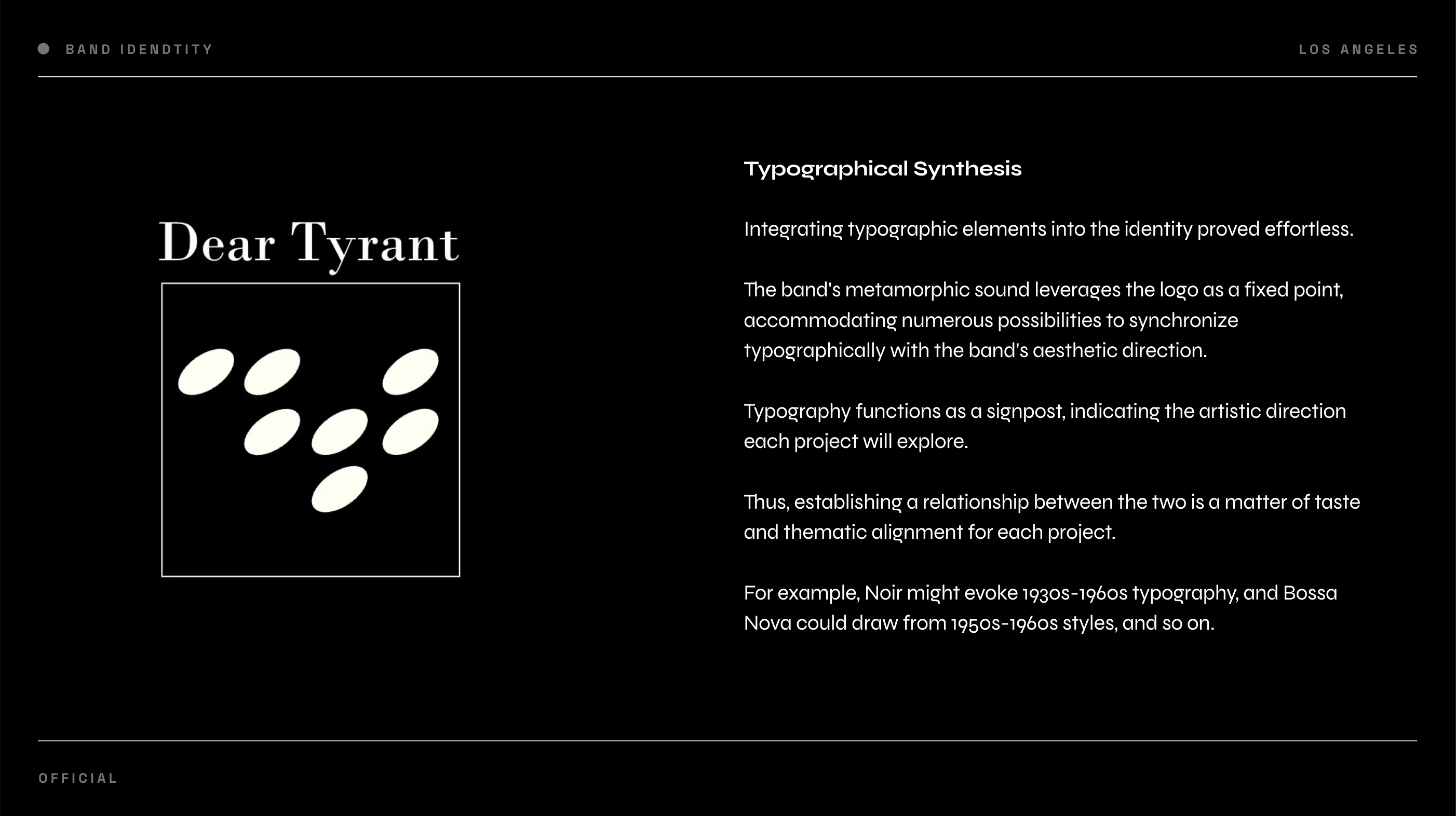
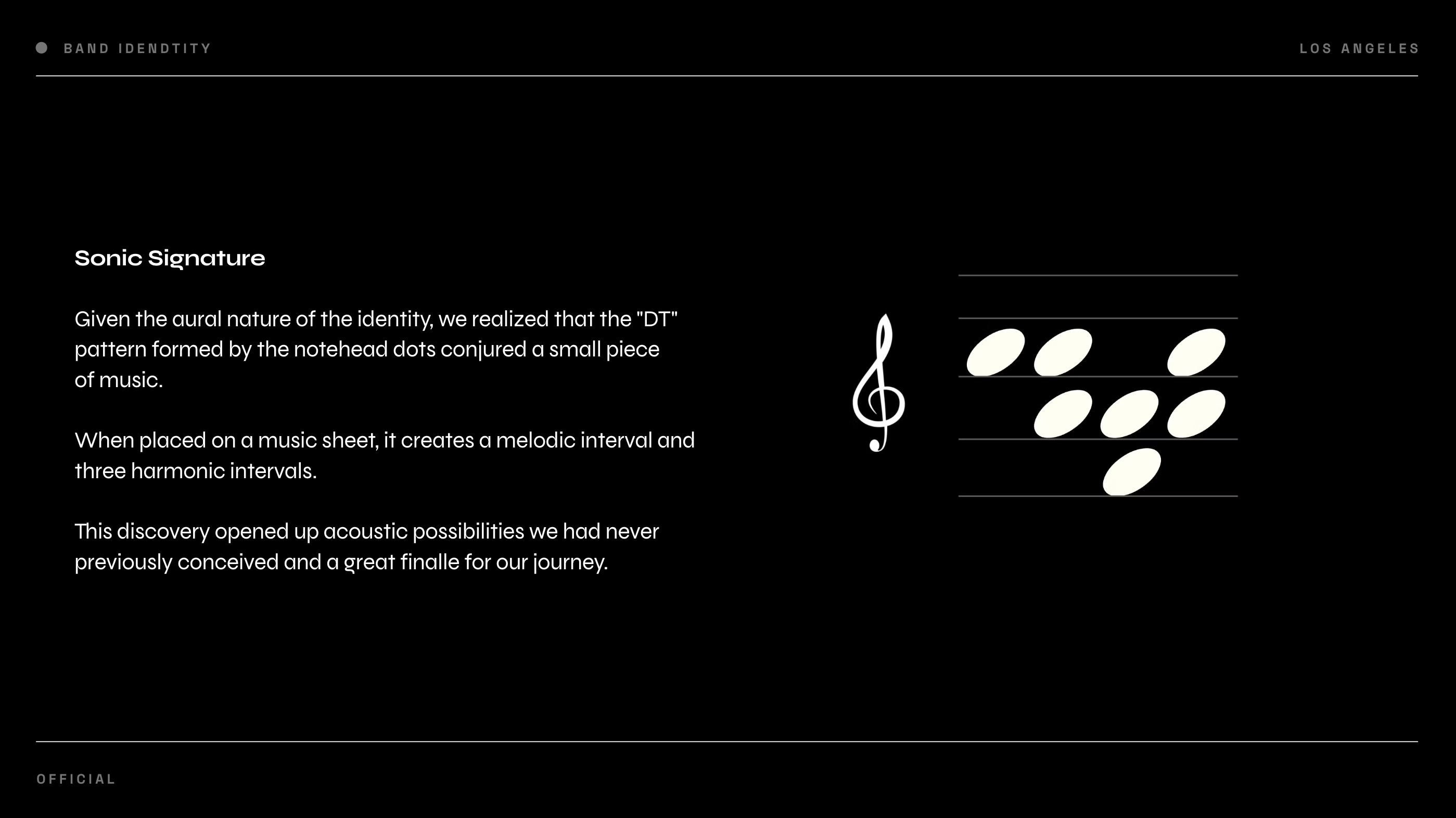
/01 Dear Tyrant
↓ Band ID
Designing a Musical Identity to Visually Match
the Band's Sound
→ Creative Direction
→ Concept
→ Graphic Design
→ Verbal Design
→ Concept
→ Graphic Design
→ Verbal Design


/02 Genuína Lindoya
↓ Soma
We developed a new business model, strategy, branding and campaign for a functional water that was going down the drain.
→ Creative Direction
→ Business Transformation
→ Strategy
→ Concept
→ Verbal Design
→ Business Transformation
→ Strategy
→ Concept
→ Verbal Design
Genuína Lindoya, one of Brazil’s largest beverage companies, was facing a problem with its new fiber-enhanced product: the target audience wasn’t engaging, and demand was low.
When Genuína Lindoya reached out, we understood that this wasn't just a communication issue; it was a business problem. Therefore, we proposed a consulting solution to completely transform their new product.
When Genuína Lindoya reached out, we understood that this wasn't just a communication issue; it was a business problem. Therefore, we proposed a consulting solution to completely transform their new product.
We defined a new business model, gave the product a purpose, developed a new strategy, repositioned it, changed the target audience entirely, and created new branding (even changing the product's name). Additionally, we crafted a campaign and established a future vision to help the brand keep up with global players and avoid disruption.
The project is ongoing, and we are in the final stages before starting production
The project is ongoing, and we are in the final stages before starting production
︎ Strategy
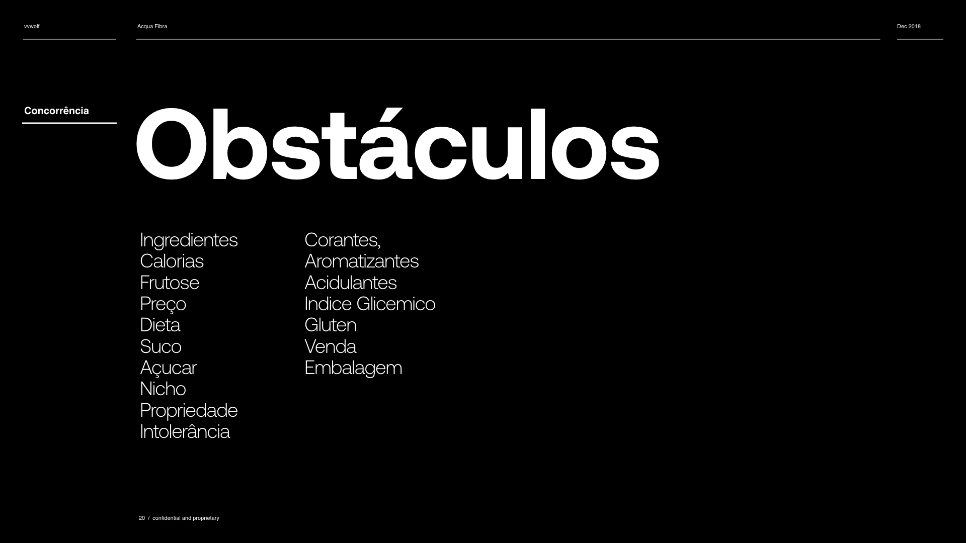
Obstacles
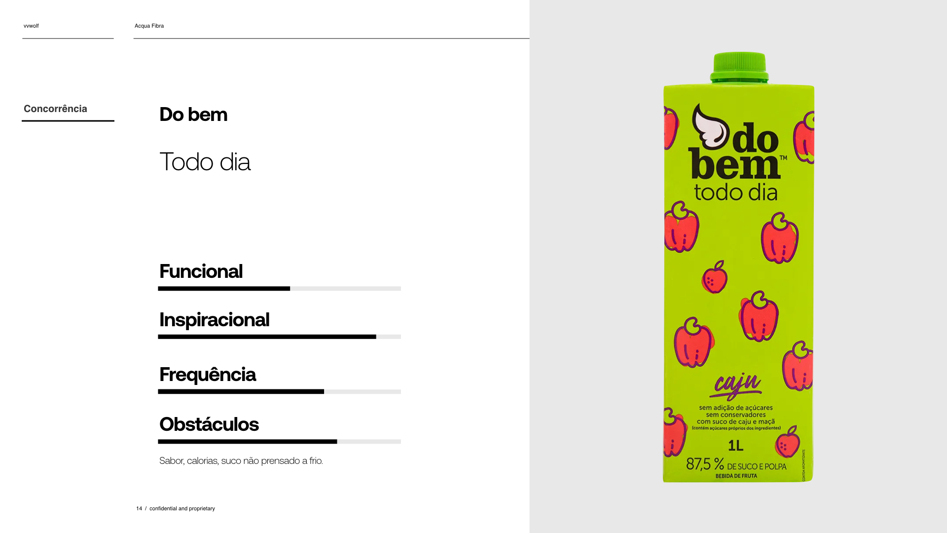
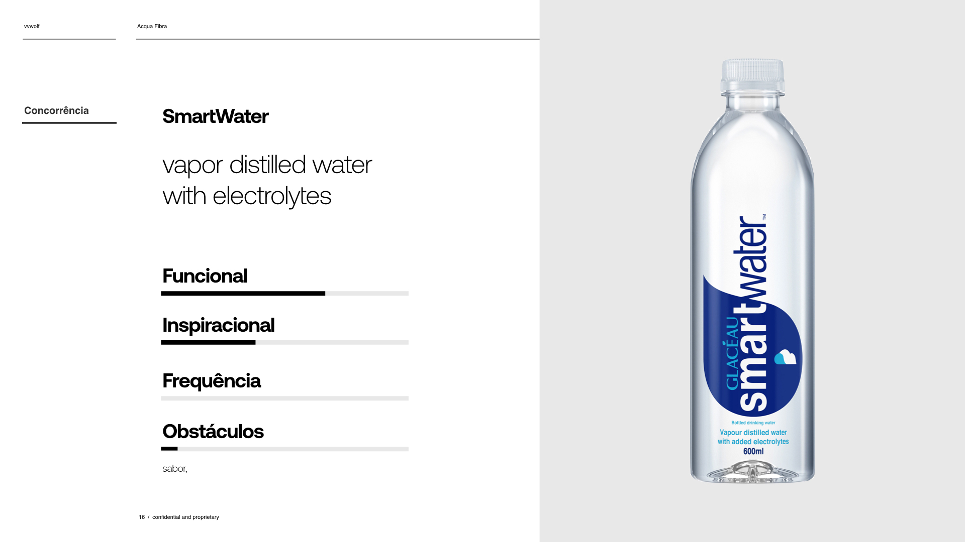
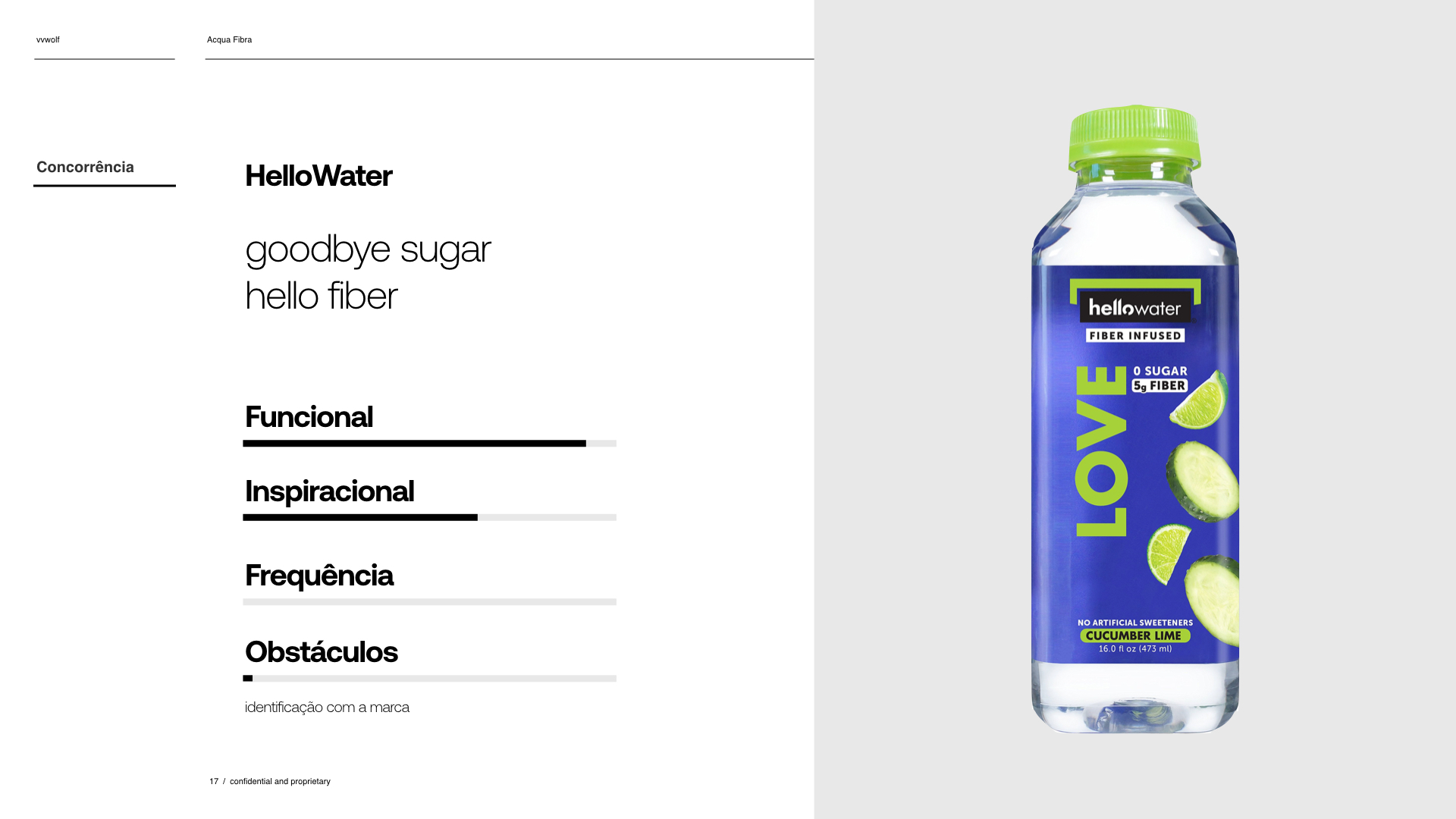
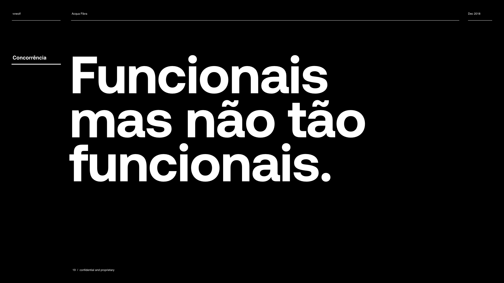
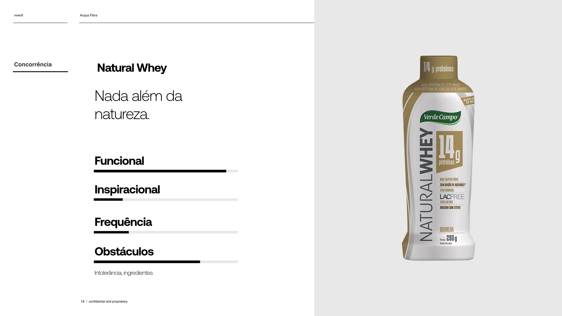
Our research showed that our competition was offering similar benefits. But we also noticed that our competitors products imposed obsctacles to consumers. Those obstacles created a problem. For functional bevarages to work they need to be consumed everyday.
Our research showed that our competition was offering similar benefits. But we also noticed that our competitors products imposed obsctacles to consumers. Those obstacles created a problem. For functional bevarages to work they need to be consumed everyday.
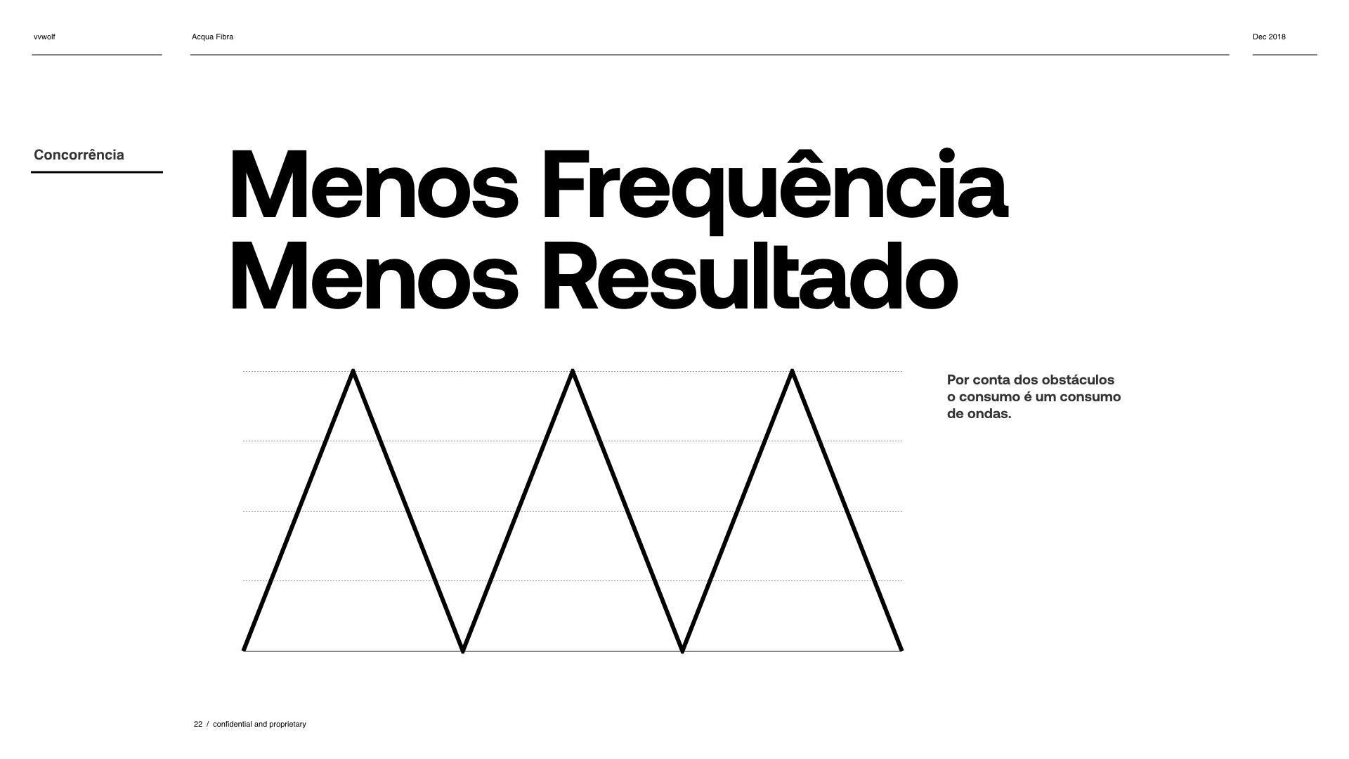
Frequency
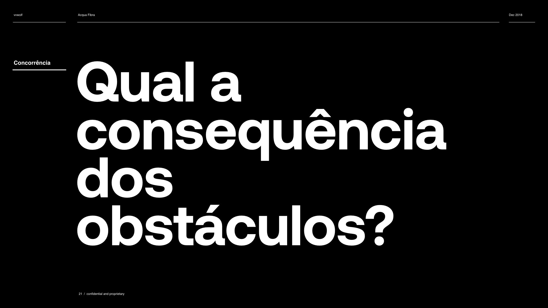
Those obstacles made our competitors beverages be less consumed, making then less functional. With that in mind, we had a clear vision of our white space, plus what our new positining should be.
Those obstacles made our competitors beverages be less consumed, making then less functional. With that in mind, we had a clear vision of our white space, plus what our new positining should be.

︎ White Space
For functional beverages to be effective, they need to be consumed frequently. To achieve daily consumption, they must present fewer obstacles. As a fiber-enhanced water with no artificial ingredients or calories, our product had fewer barriers and could be consumed more regularly. This advantage allowed us to position our product uniquely in the market.

︎ Branding
The white space alone wouldn't be sufficient. Therefore, we needed to develop a powerful branding system that people could relate to and understand.
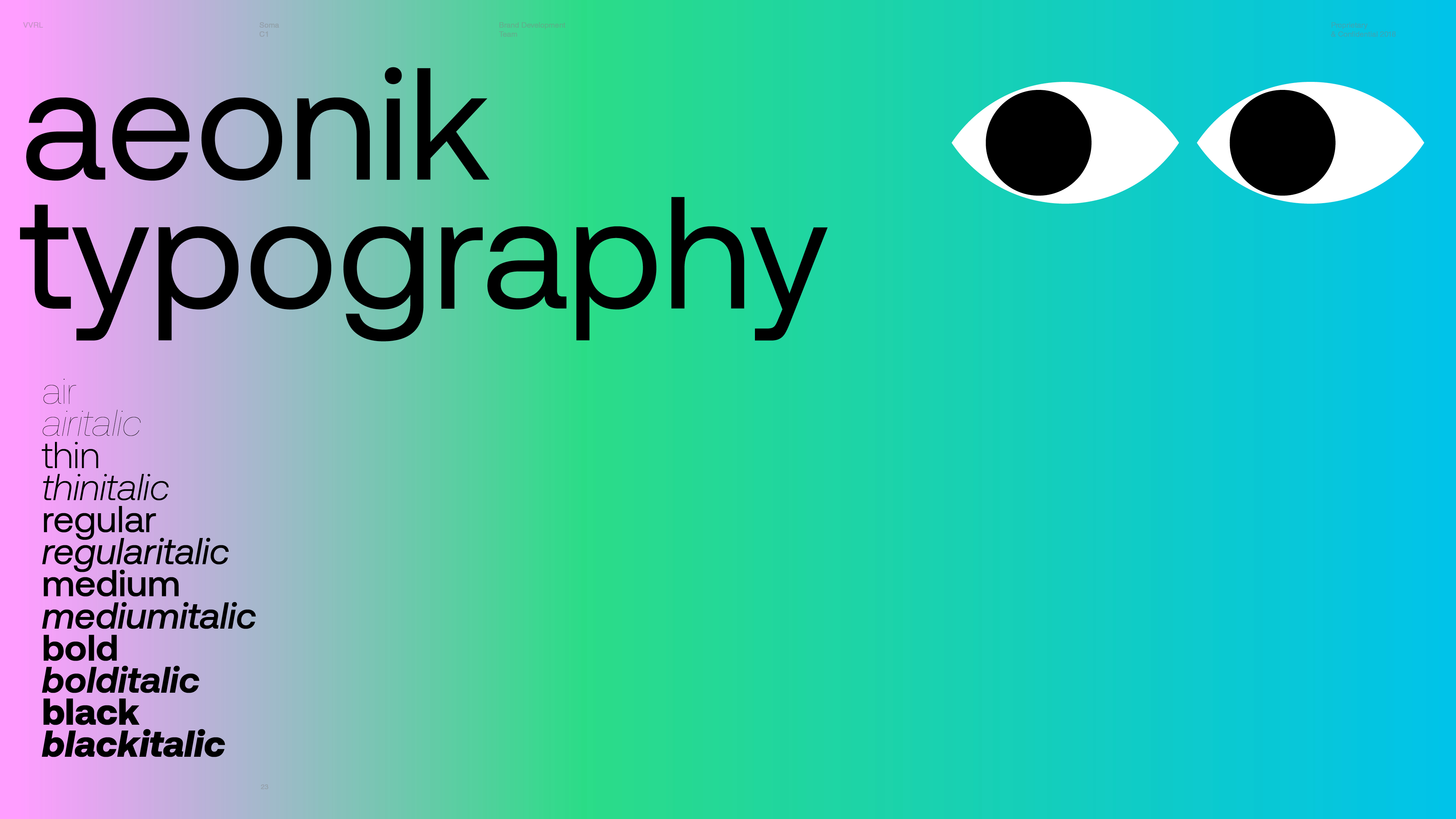
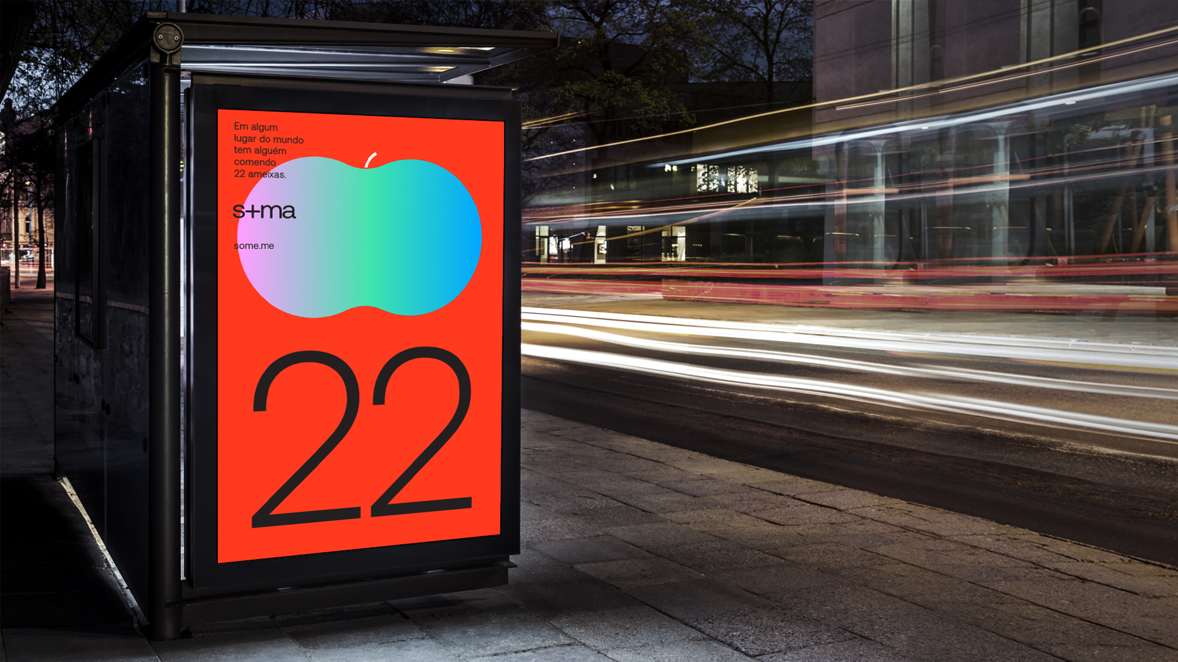
First, we needed to change the name. The goal was simple: create an inspiring and functional name. Thus, AcquaFibra became Soma (Sum in English). The more you drink, the more health you add


︎ Packaging
We came up with a packaging that translated visually our product components (Water + Fiber + Flavor).


︎ Campaign
The campaign was developed to inspire people to add a positive difference every day.
As a residual message, we wanted our target audience to identify with the product and understand what SOMA is.
As a residual message, we wanted our target audience to identify with the product and understand what SOMA is.
AquaFibra was originally targeted at elderly people as a medicinal product. This was a mistake. We broadened the target audience for SOMA to include Gen Z, Millennials, Generation X, and Baby Boomers, enhancing the business potential twentyfold.
We also developed a cool and diverse brand that spoke about health to everyone—a brand that both cool kids and cool grandmas could share.
We also developed a cool and diverse brand that spoke about health to everyone—a brand that both cool kids and cool grandmas could share.


/03 Mariana Gatti
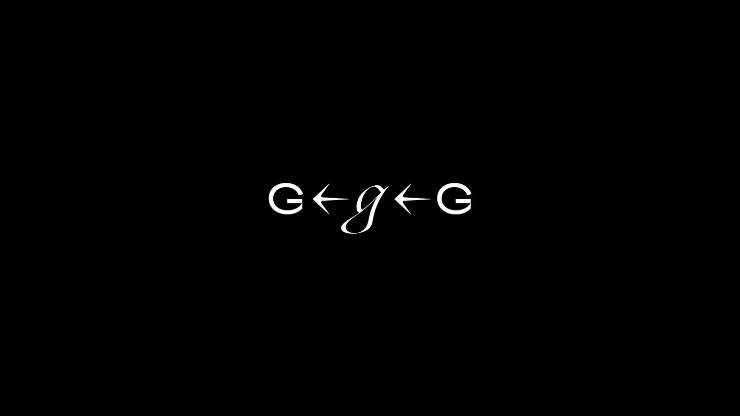
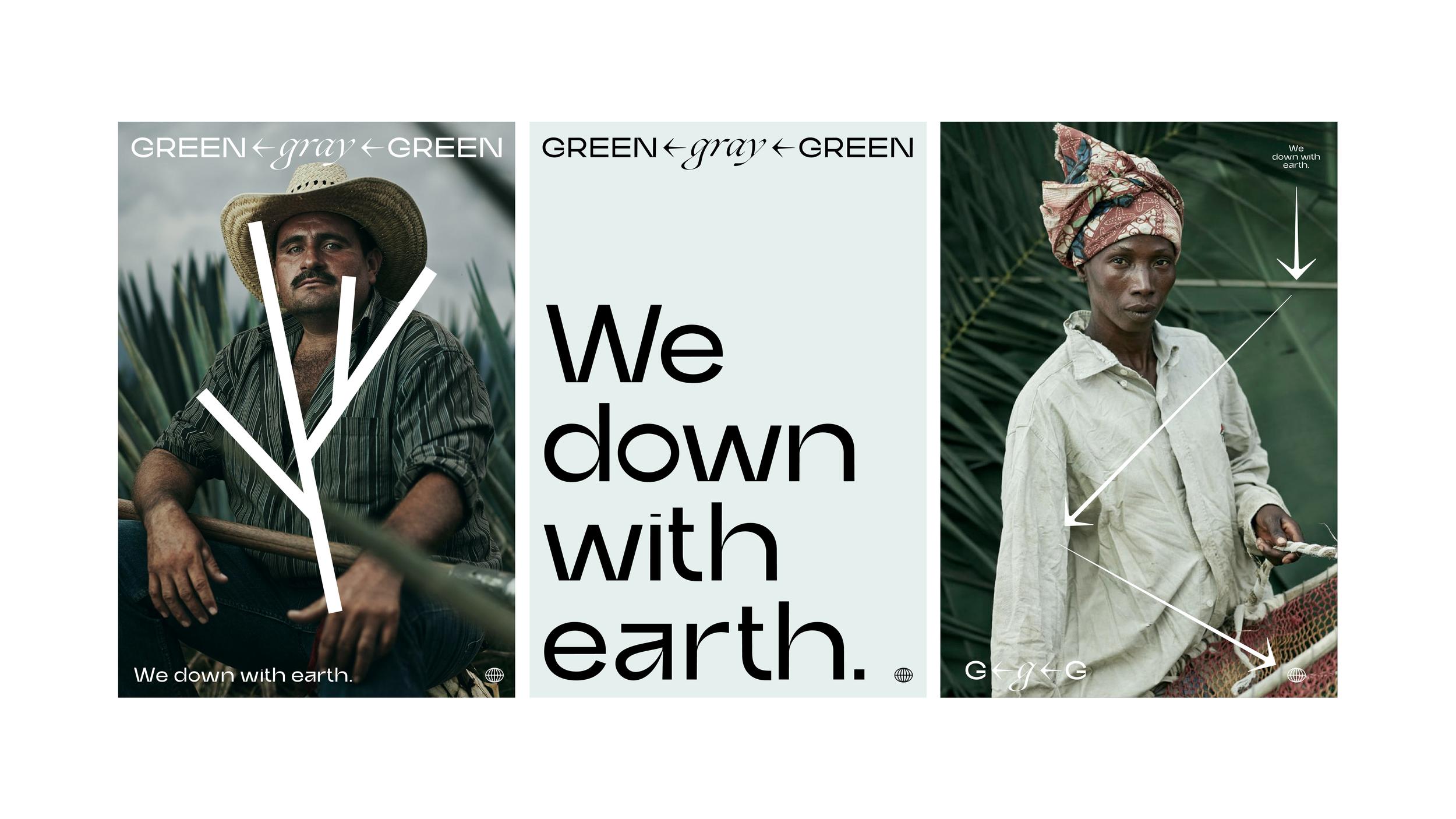
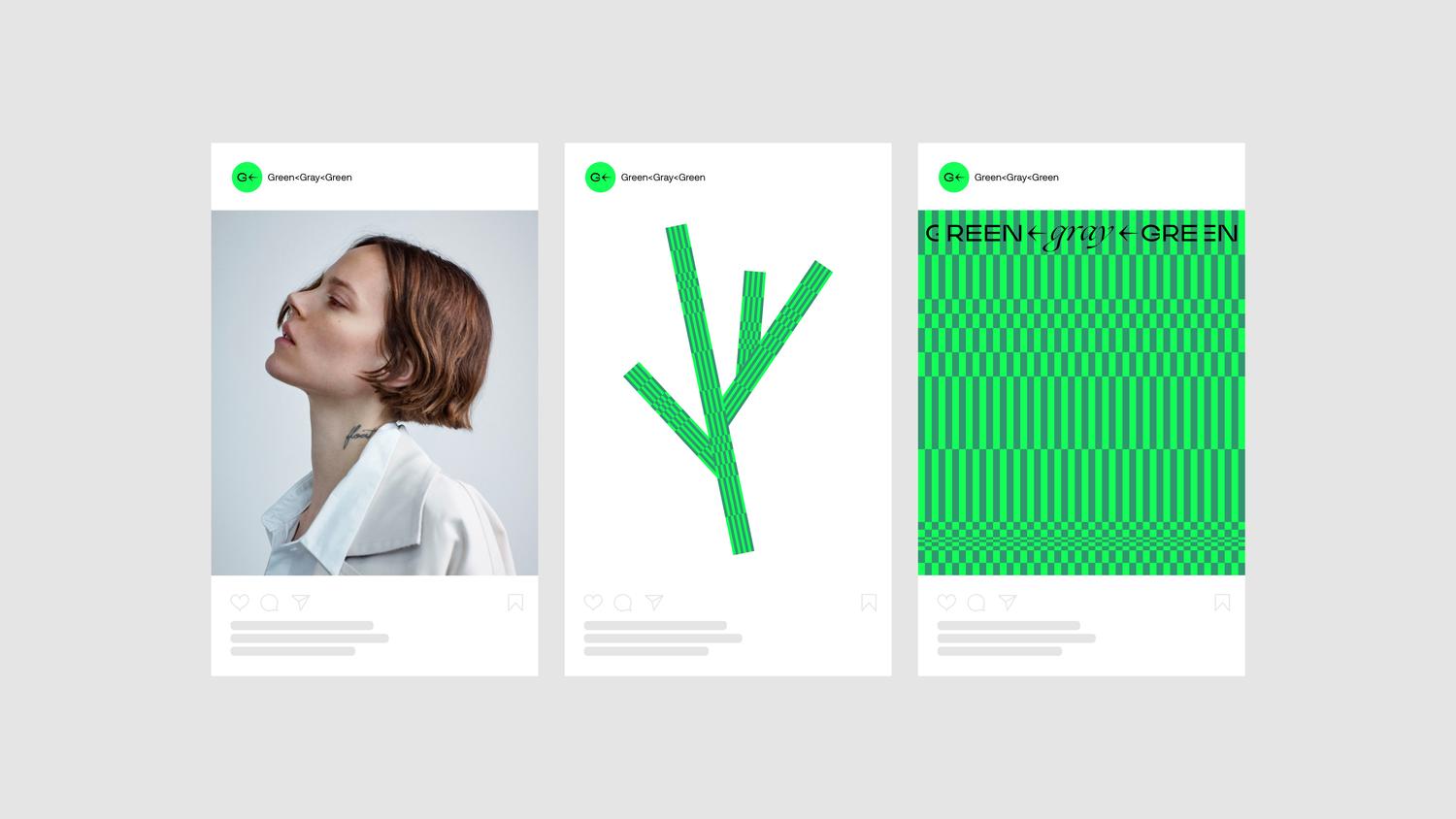
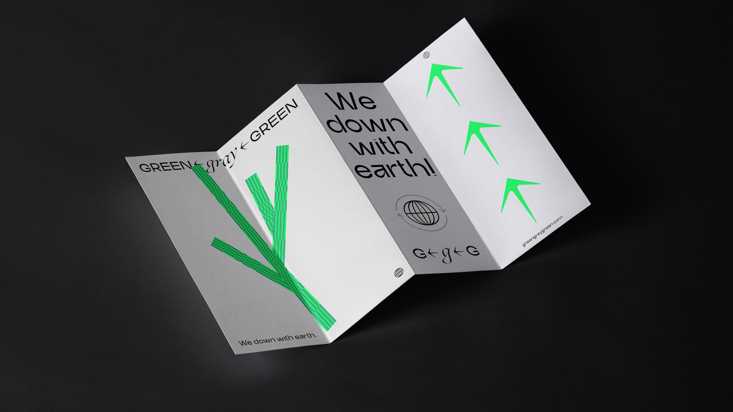
↓ Green︎︎︎Gray︎︎︎Green
A branding sytem designed to make sustainability fashionable.
→ Creative Direction
→ Business Transformation
→ Strategy
→ Concept
→ Verbal Design
→ Business Transformation
→ Strategy
→ Concept
→ Verbal Design
GGG's goal is to question dominant sustainability myths and develop greenwashing-proof strategies, projects, and products for regenerative impact to protect endangered cultures, creativity, and crafts.
To develop their branding system, we addressed the following question: How can we translate the idea of regenerative systems into a brand, both verbally and visually?
Regenerative systems are about creating sustainable cycles, marking a departure from the old ways of "farming fashion."
To develop their branding system, we addressed the following question: How can we translate the idea of regenerative systems into a brand, both verbally and visually?
Regenerative systems are about creating sustainable cycles, marking a departure from the old ways of "farming fashion."
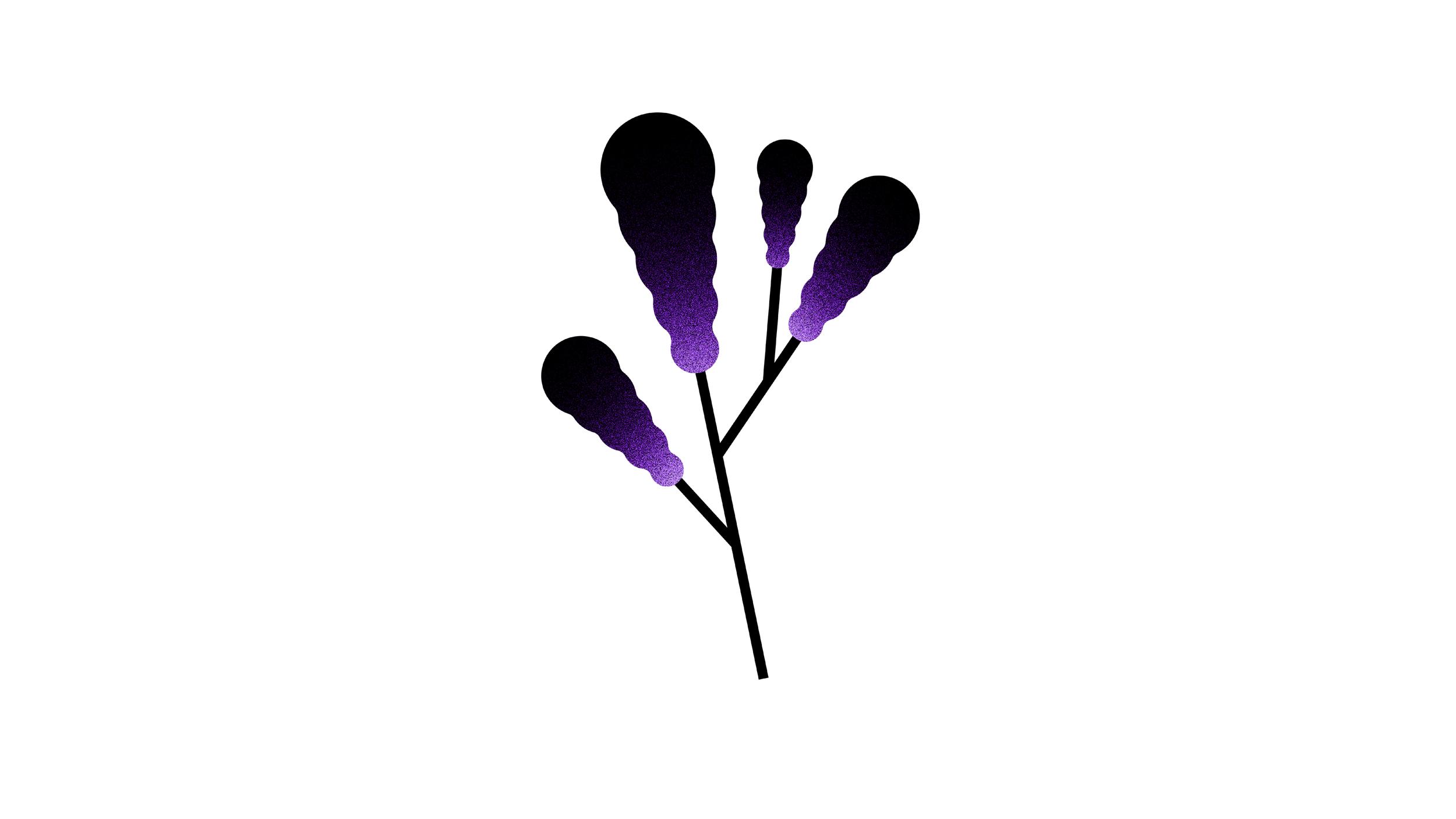
From Cotton • Cloth • Soil degradation to Cotton • Cloth • Soil regeneration
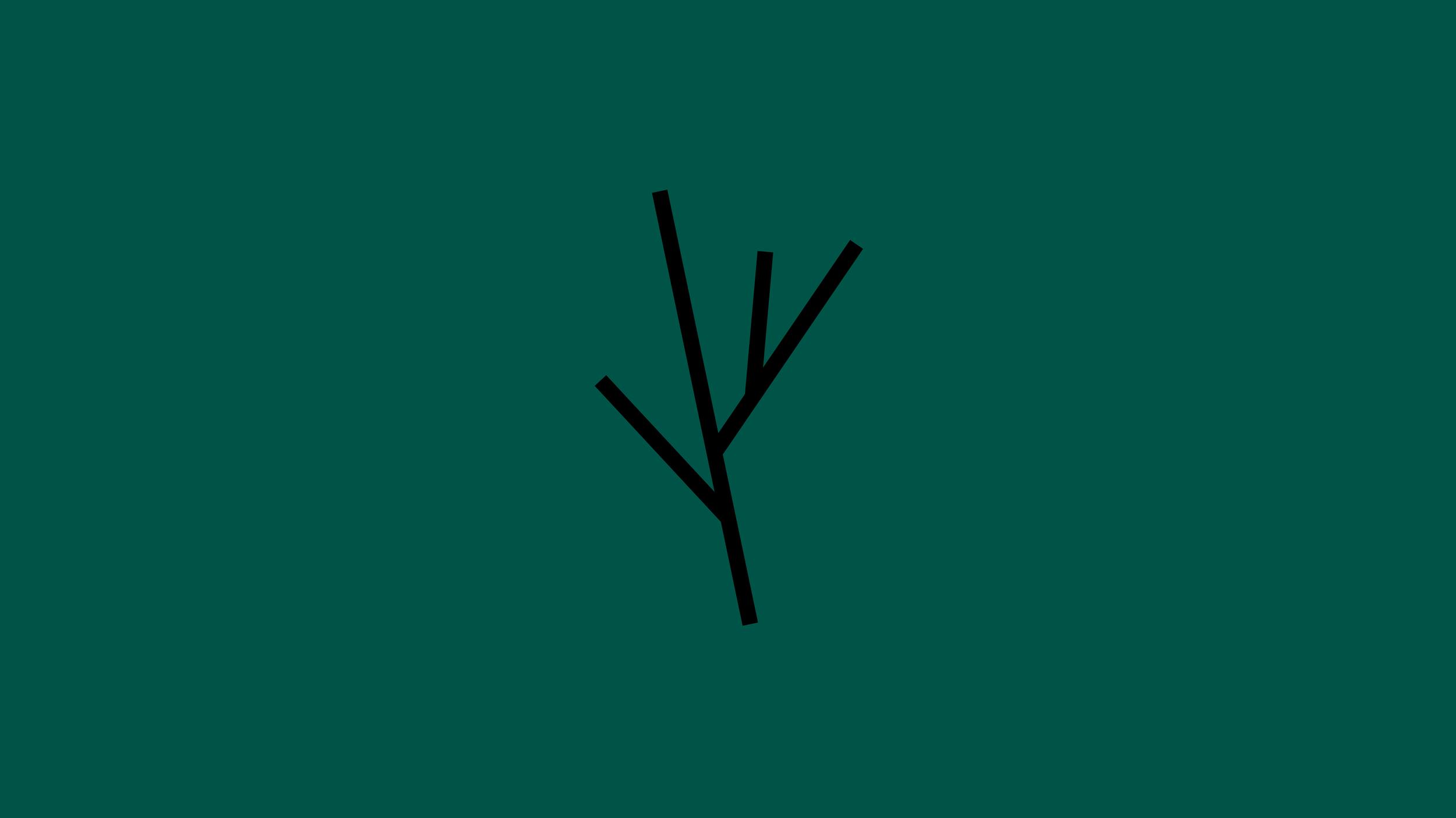
The idea was to translate these cycles of sustainability into our branding system. From the name—GreenGrayGreen—to the logo, the goal was to convey a story of regeneration within our visual system.
Thus, we created the first regenerative branding system. It begins in one way, changes, and then returns to its origin, embodying the concept of sustainable cycles within our visual and verbal identity.